
In this week’s tutorial, we reviewed personal blog sites. My tutor Andy gave me feedback on my personal blog site from the First Impressions/Findability, NAV/Professionalism/UX sections.

Thankfully, my personal blog looks good on the whole, and I use thumbnails on the home page and on the blog pages to make my work visual and easy to find. I also designed a funny Logo for my personal web page — a person. Because I always want to do “People-centered” design, think about problems start of users, which is also the original intention of my learning design.

However, in terms of user experience, my website still has some things to do. One of the key reasons was that the image size and pixels I uploaded were too large and the web page was not loading smoothly. So, in order to speed up the load of the web page, I split some long images into several pieces and reduced the size of the images.
In addition, in order to modify the interactive function of the webpage, I also made the following modifications to my webpage:
1. I met some small problems, buttons on the menu bar cannot change color when the mouse is hovering over it, which reduces the user’s experience.
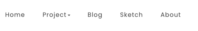
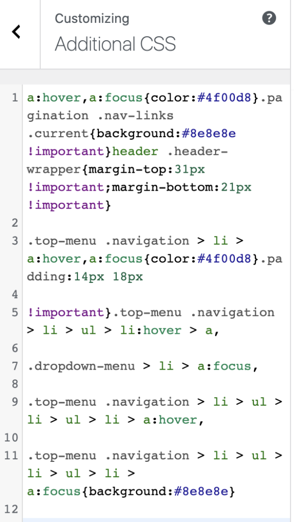
So I added an extra hover code:
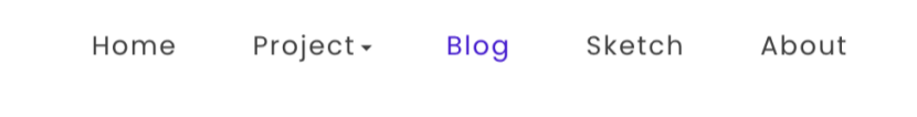
The effect is as follows:
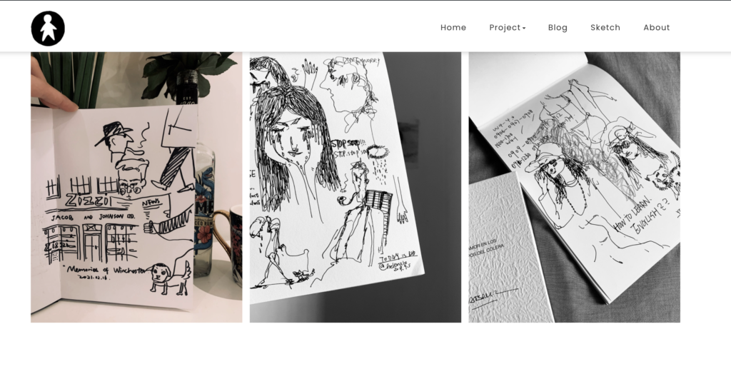
2. I also added a sticky menu that stays at the top of the page as the user scrolls down. When the user has finished browsing the current page, they can click on the sticky menu to directly browse other pages without returning to the main page.
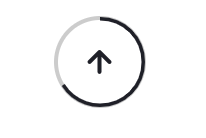
3. I added a Back to the Top button to each page. This button can return to the top of the page at any time and change the progress bar according to the user’s reading progress.
4. Since my project has not been completed, the sketch and title on the main page will be improved after the completion of the project. Design a unified style of thumbnail cover and title. Make the page look more integrated.